Playroom Reveal
You saw how we were living. Small NYC apartment, cramped quarters, everything all in one room. It started out just fine. Despite my assertions that I didn’t want to raise a baby in the city, I found that it was actually quite easy. In fact, a lot of it seemed easier than it would in the suburbs. Then the gear grew, she started to crawl and walk, holidays and birthdays meant bigger toys and long winters meant lots of time inside. And I started to go a bit crazy. So, when it came time to talk about moving and look for a house, I knew there needed to be space for a proper playroom.
Once we found ours and I saw the previous little girl’s room, I knew it was it. First of all, it might be the biggest room in the house. It has beautiful windows, gets so much light, has a slanted ceiling in one part with a little nook complete with the cutest porthole window. There’s a closet, I knew I could trick out with toys and it’s right next to the kids’ bathroom and across from their bedrooms and down the hall from ours, which means it’s upstairs. Plenty of people questioned me on this. A second floor playroom? Are you sure you don’t want it next to the kitchen or living room? In the basement? Wouldn’t it be better if when you were cooking, preparing their meals or doing work, you could see them? Clearly, I wasn’t concerned. This room screamed playroom, there was no other option for me. Plus, I like that the downstairs is more adult and there’s one massive room devoted to the kids, after living in romper room for four years. And so, once I had the location determined, I started plotting.
I knew I wanted it bright and whimsical– a kids dream room. I wanted every surface and square inch to have something appeal. We painted the pink walls white (Sherwin-Williams’ Greek Villa, a shade all of you helped choose when I was going insane about how many whites there are! I love how this turned out. It’s the perfect neutral- not too blue, not too warm, a soft, subtle backdrop for all of the vibrant colors in the room.), which helped immensely to brighten up the space. I fell in love with an x and o rug and before I could purchase it, it was discontinued. I had the whole room and color scheme planned around it so it was back to the beginning. Then I saw this rug (which I doubled up) and started to get excited again.
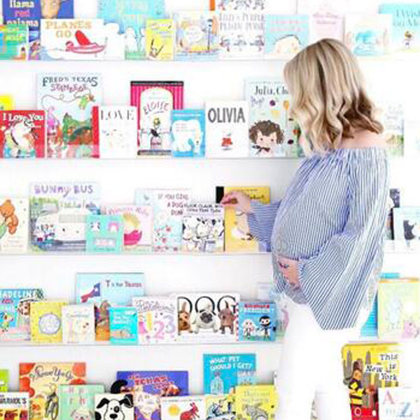
As we’ve established, Lilly LOVES to read so a) I wanted to make that a focal point of the room, not just have it be about toys and b) I needed more space and organization for our growing collection so a book wall it was! Just some of our favorite books here.


I planned on painting an entire wall with magnet paint but my painter said it doesn’t work well and everything I read online supported his statement. So I opted to get a galvanized metal sheet (so much more affordable and adaptable- don’t want it in a year or two, take it down versus having to paint over it) and it works so well, holding a ton of heavy magnets.

I included one of my favorite quotes from A.A. Milne that I commissioned from two lovely ladies in Israel cause I just felt like that wall (and the room) was aching for some inspiration. Plus, it’s absolutely true about meeting Lilly for the first time. In fact, Nat’s Next Adventure was formed because of her; I couldn’t imagine going back to work 24/7 with her in my life so I pondered what my next thing would be as I played around on a tumblr account.

I filled the room with her old stuff (table with insert, kitchen, washer and dryer, dollhouse, high chair, dress up rack and mirror, pom pom and white bins…) but they look so much better when not all crammed together and in this space.

I went with Sissy + Marley’s Dream paper in silver (I was originally going to go with another one of their designs when it was the other rug but you can’t go wrong with any of them!). I added a bunch of different colorful poufs (blue, petal, yellow, dove, green, aqua) and bright teepee from one of our favorite places, The Land of Nod.

With the old rug and color scheme, I was thinking of doing stuffed animal heads, then I found these stuffed ice creams and scratched the safari theme. These are so much more fun and much more Lilly. Plus, they work perfectly with the rug.

Lilly races in every morning and spends much of her time there. If I let her, she’d spend all day, every day; it’s a negotiation to get her out of her PJ’s, playroom and to the outside world. Can’t say I blame her.

Shop most of the post here:
[show_lookbook_widget id=”362453″]
Professional photos by: Jennifer Lavelle
This post is sponsored by Sherwin-Williams.
