Living Room Reveal
I’ve been trying to do this post for 4 years. But, honestly, it took me a while to get our living room right. That’s actually the case for much of our home. It’s hard to tell what you’ll need, like and what will work in a space until you live in it. Some rooms I nail right away and never change. Others take a bit to get there. Such was the case with our living room. There’s been a lot of trial and error and many iterations.
My initial instincts were spot on and remain today. I told Zach we couldn’t get the house until we met with a contractor to see if we could create more light in the space. I don’t think I have seasonal depression (just overall depression!) because I love winter. Cozy sweaters, a roaring fire, snow falling, soup on the stove… At least, a few months of it. But I am adverse to dark living spaces. That depresses me. I need windows and bright, colorful spaces. I lived with tan walls for 4 years in the city, green for 2 and a red dining room once. I learned very quickly that was not my color palette. I actually grew up with a lot of blue and white. So much so that I gre sick of it. My childhood bedroom and my school colors were both blue and white (it was my college colors too) and I desperately craved something else. So when my mom said I could redecorate my room for high school, I went dark. Black and white everything. Black and white striped wallpaper, patterned chair, bedding and… a black carpet. It was terrible. Even the magazine cutouts I taped to my wall had to be void of any other hue. I thought I was edgy.
Since then, I experimented with a lot of different colors… In our California home, I started to dip my toe into the blue and white world again with a navy dining room, white couch and blue and white patterned chairs for the living room. But it wasn’t until this house that I really let my flag fly. To me, blue and white is neutral. It’s serene and easy on the eye but still adds personality and color unlike minimal spaces.
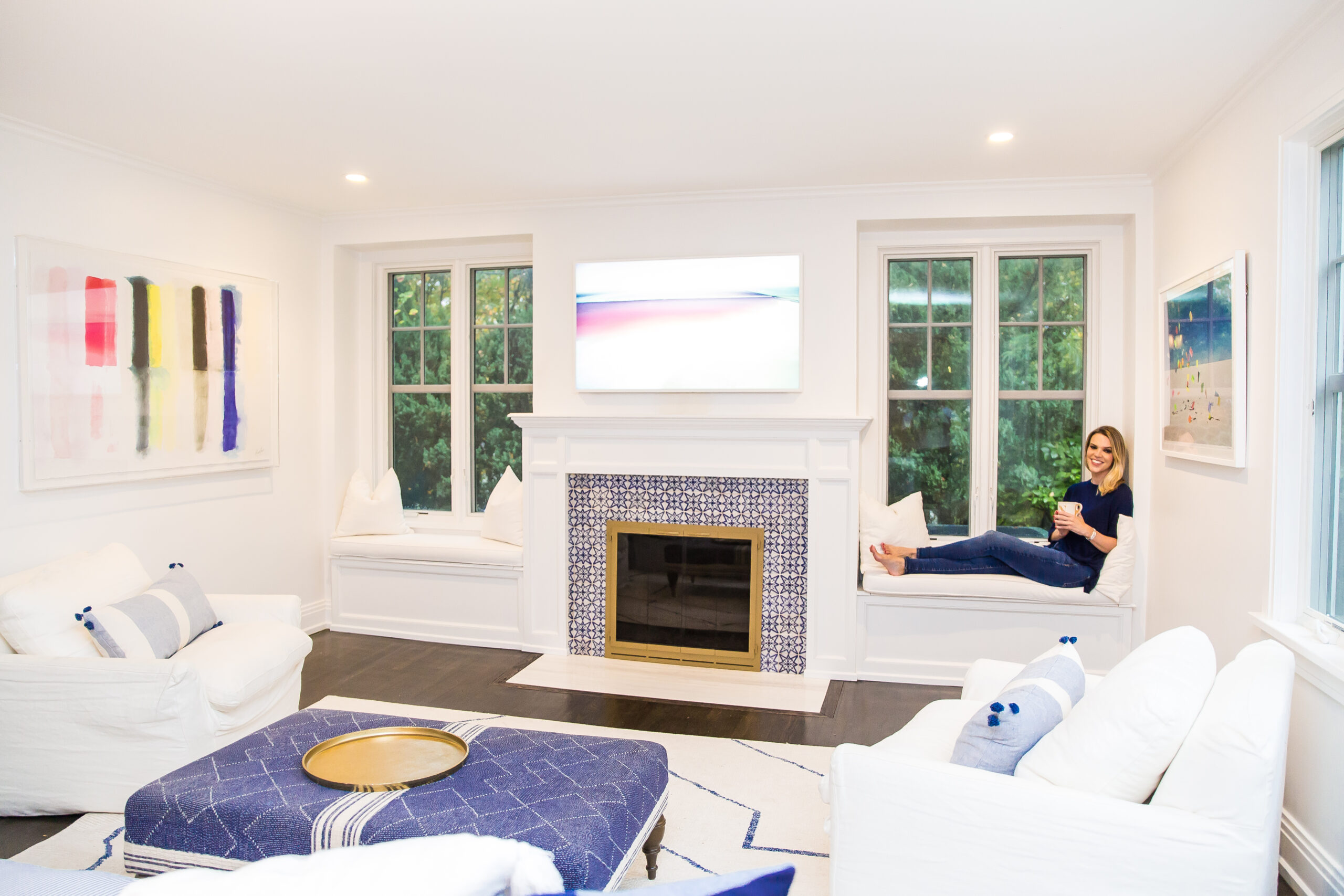
But back to the construction for a minute. I normally love a good bookshelf but not when it blocks light. In the previous room, the long bookcases made for very small windows, a cramped mantel and not a lot of sunlight. While I loved the blue walls, they were too dark, especially with the limited window space. So we knocked out the shelves, added new, longer windows, window seats and lowered the mantel. (We also did all new windows on the other wall.) And the transformation is amazing. Painting the entire room white also allowed for so much brightness. (We used Benjamin Moore Super White, which is too “white” in my opinion. It actually creates a bit of a blue hue and that’s one place I didn’t want blue! Next time I’ll go for their Simply White or another color altogether.)

The next move was to retile the fireplace. The previous one was a combination of dark green and black marble and the floor (our house was built in 1907) had settled, was uneven and one of the corners jutted out. It was a constant debate between Zach and I. Stupidly, all we focused on was the window and mantel construction and didn’t even consider the fireplace. In hindsight, they should’ve all been done at the same time. But I was very pregnant, the room was taped off and I never really spent any time in there, staring at it. It only took Zach tripping on the marble flooring and nearly taking off his toe to agree that it must be fixed.
And that’s where you guys came in! I started this site as a choose my own adventure blog where my readers (you!) weighed in on everything I did, including how I decorated my home. I think the first home decor decision you made was for temporary wallpaper for an accent wall in our city apartment. It continued with everything in Lilly’s big girl room– her bed, bedding, carpet, etc. With this house, you helped with a lot as well. Everything from window seat cushions and pillows to our hallway runner. And… the fireplace tile. I knew I wanted to go bold since a lot of the room was going to be neutral. But then I had a momentary panic since tile isn’t the easiest or most affordable to change. What if I hated it? Would it be bad for resale? I had you guys vote and it was mixed. Many of you thought I was crazy. But just enough of you gave me the confidence boost I needed to go for it. Then it became, which pattern? I narrowed it down to nine. NINE. That’s a lot. There was a lot of voting. But I’m so happy with the tile that we chose together. And I think it makes a world of difference in the room.
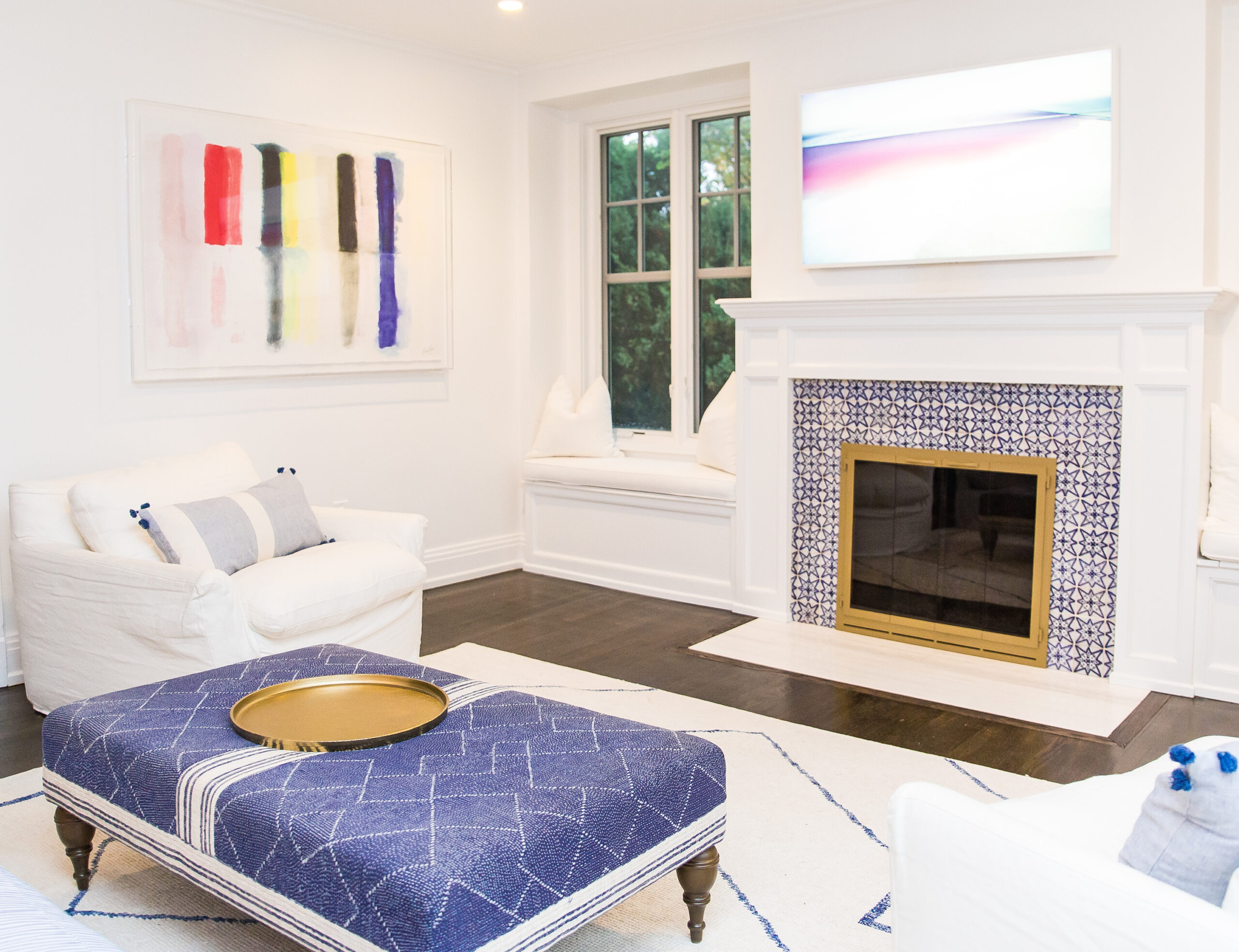
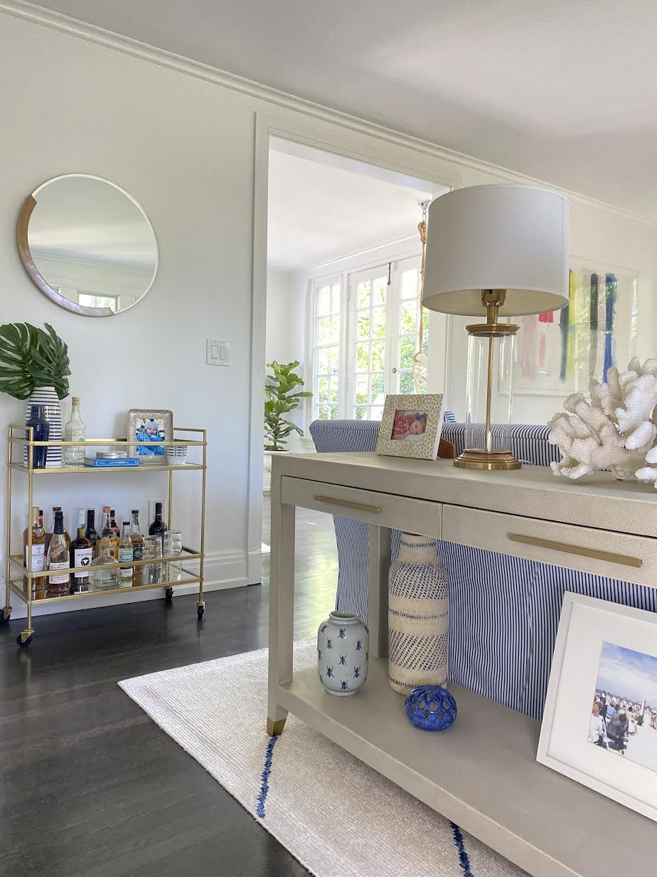
The other three obvious items for me were the couch, chairs and console. I fell in love with this Serena & Lily couch in the Perennials Pinstripe French Blue. I was so tired of solid ones (We’ve had tan, cream, white), I wanted something different. I love the feel of the Restoration Hardware cloud couches but I wanted something a bit more structured for the main piece in the room so it was a little more pulled together and not too slouchy since it was already going to be casual enough so the compromise was cloud chairs. I like that they provide a lived-in feel as that’s what I wanted much of our home to be. And the shagreen console table is one of my favorite pieces. I like that it adds another dimension to the room. There’s not much leather in our house and it was fun to incorporate some here, still staying within my color palette. I like the sophistication of the piece but also that it’s a rougher, untamed material that echoes the overall vibe. And I love the way it looks when you walk into the room. I think it elevates the space and provides some warmth and texture.
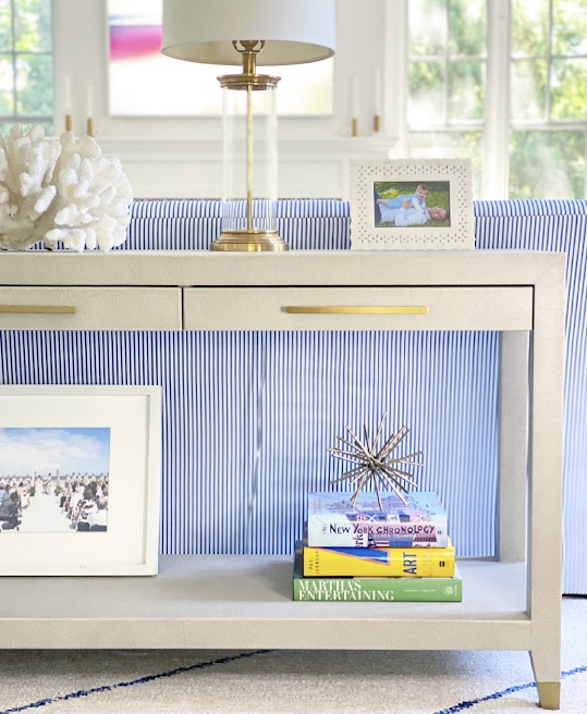
I briefly worked with an à la carte designer who didn’t really work out. But to her credit, the one thing she did suggest was lamps on the console. I don’t think I would have thought of that. Nor did I think it could be done, but our contractor cut holes in the rug (gasp!) that are under the couch and will never been seen so they’re functional as well as stylish. And I love the ambient light they provide. It’s so cozy in there at night with just the lamps and without the recessed lighting.
Styling of shelves and tables is always so fun for me. But it often takes a while to get there. In this case, I knew I wanted to incorporate a large piece of coral my mother-in-law bought us. It’s gorgeous, special and fits perfectly in our coastal living room and home. I love that it brings in a natural element, which I think always gives dimension and a grounded-ness to the space.
I have to have books in every room. I love a good coffee table collection and have been acquiring them since my early days in publishing. I was that girl who was saving (and moving!) giant, heavy coffee table books for a future home as well as kids books for my future children. I included New York Chronology, a vintage Martha’s Entertaining and an art book. I love using objects to stack on top of books or simply placing on a shelf or table. The brass spike is no longer available, but I have this knot in another room and really like it.
I’m, personally, not a fan of doing huge family photos in the home so consoles, bookshelves and the occasional gallery wall are the perfect place for them. On the console, I have two favorite photos of Lilly as a baby (I have to add more Oliver! Poor second child.) in frames that mean something. One I bought when Zach and I were in the South of France together. I can’t remember where the other one came from (mom brain!), but both were at our wedding. And speaking of our wedding, that’s the one place I have a photo of it represented. In our California home, the first after we married, there was an entire gallery wall of wedding photos. It was a wedding shrine and the thought of it makes me cringe a little bit now. I think it’s so much more powerful and special when peppered in. This particular wedding photo is a wide shot so it looks more like art, a photograph of a beautiful beach than your traditional wedding photo.
A good vase goes a long way when styling and I love things in threes so that’s what I did here. You can find so many good, affordable ones now so it’s an inexpensive but elevated way of decorating. Target is a great place to get decorative vases (and a million other things, am I right?). Here are a few of my current favorites: textured ceramic, Studio McGee, bamboo.
I love a wallpapered bookshelf and was planning on doing one in this house. But since the room was already blue and there’s wallpaper right across the hall, I kept the previous paint in just that section. I love the way it pops. Once again, I had so much fun styling these shelves. I think every space should have some greenery, ceramics, frames, books, art, photos, collectibles and meaningful items to provide a nice variety and showcase many things that matter to you and make up your home.
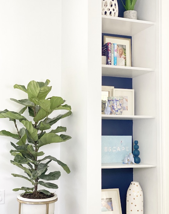
I used these bookends to hold a few of my favorites like Untamed by Glennon Doyle, Big Magic by Elizabeth Gilbert and I Know Why The Caged Bird Sings by Maya Angelou, my first love. I’ve had these matted frames and just change up the photo and the spot depending on the house and my mood. I can’t quit a good coffee table book. This Gray Malin one is so serene and I love the message it conveys. Who doesn’t want to escape?! It helps me channel a life of adventure.
I have zero green thumbs and killed the last plant I had but I’m trying again! This planter brings a modern touch with the mix of concrete and brass. I’ve moved it all around our house and it works in every room.
While we’re on the subject of photos and art, let’s chat about the wall behind the couch. I’d been coveting a Gray Malin piece for awhile and finally decided it was time to splurge on it. I love his style, color and whimsy, but I didn’t want the widely popular beach series. I wanted something fresh and different and I found it in this Neon Paper piece and knew it was it. I thought the size I purchased was perfect and it sat on that wall for awhile. Over time, I realized it was too small. So to a smaller wall it went.
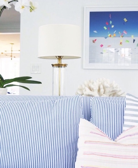
The pillows have also been a work in progress. I loved these bright stripes to play off the photograph and like that stripes on stripes is something unexpected and maybe even a little taboo. I think it really worked when the room was in this state. Once I switched to the gallery wall of deeper blues and the weather got cooler, I felt the need to add a little more texture. So I worked with Serena & Lily to add some more seasonal pillows. They chose the color block wool pillows (sold out but similar ones here) and the contrasting stripes. I just have to switch out the inserts on the stripes because they’re too flat and need a little more bulk and slouch. The lumbar pillows on the chairs are also sold out, but there’s very similar ones here.
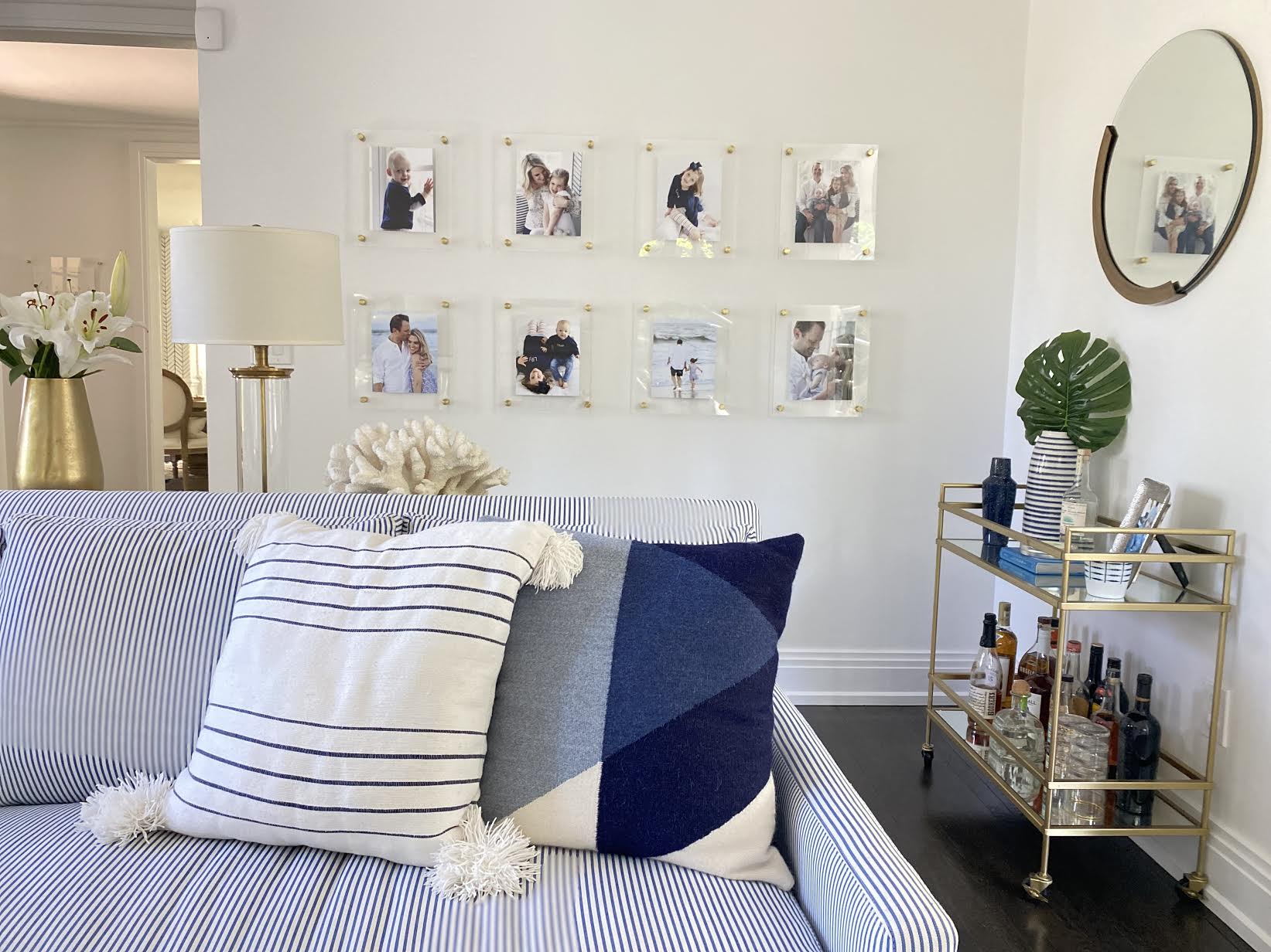
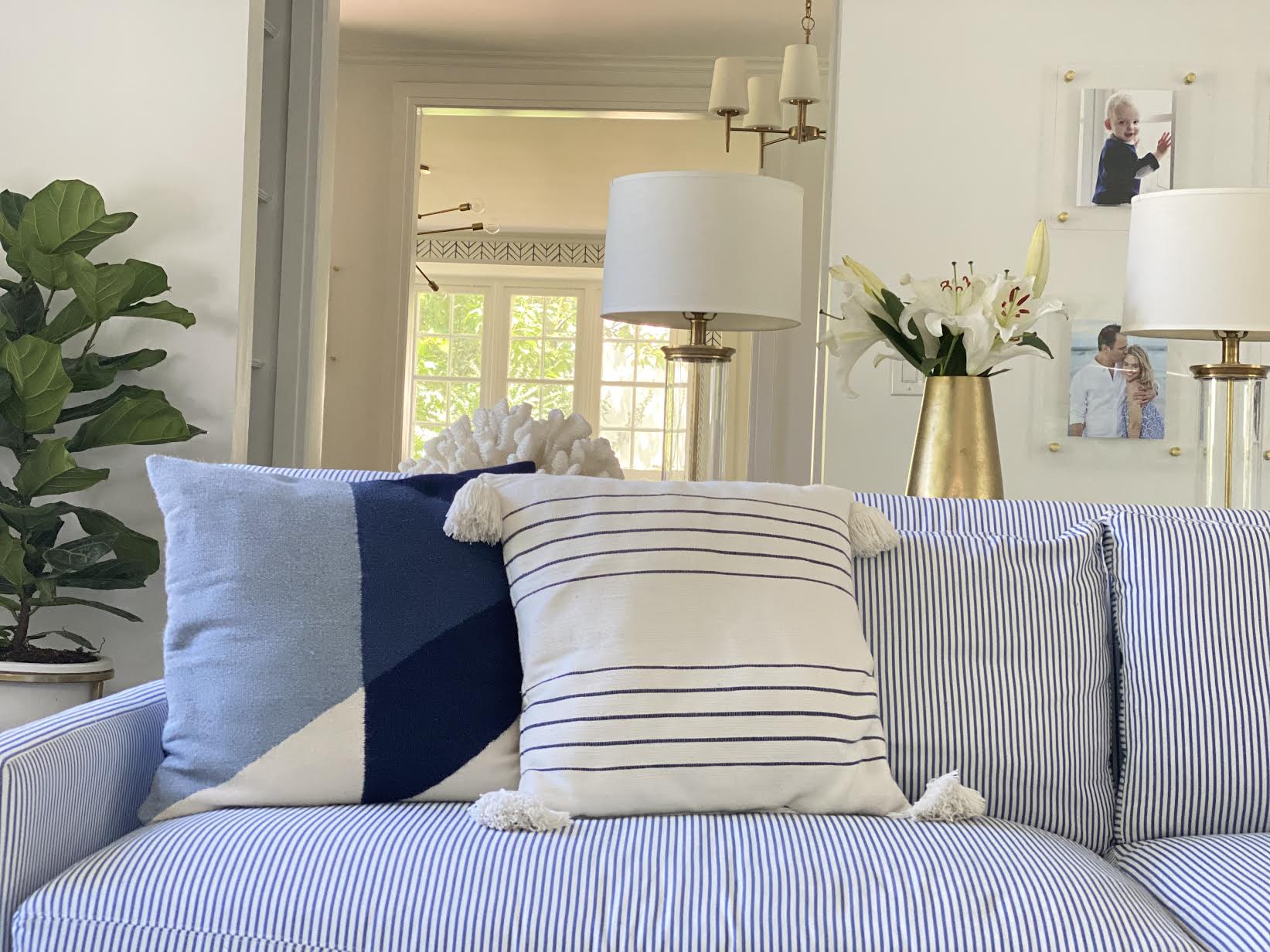
I knew the newly blank space would be a good place for a gallery wall because it was large enough. But I also liked that it’s slightly hidden. When I found these floating frames, it was settled. I love the modernity of the acrylic frame with the brass bolts. They pick up the other brass elements (fireplace, lamps, bar cart, mirror) of the room and feel fresh. The Artifact Uprising ones print the photos and adhere them to the frame for you. I always end up doing mine a dozen times because they’re crooked! But you can get just the frames and do it yourself for a more affordable price. I made an effort to choose similar hued photos. In in my case, that’s not hard since we have a family color palette, which is the same as our home and most of our professional photos are in that color scheme. I know, I know. I have issues. But it makes dressing and styling easy! This is also where being a blogger comes into play because we have no shortage of professional photos from over the years. The same frames and color palette gives it a cohesive, well-curated look. I just made sure to vary them in the sense that there’s not a photo of four of us right next to or above one of four of us. I tried to represent a mix of each kids separately, the kids together, one with each parent or both, etc. I love things in threes and actually wish I’d done a third row. I have the frames with the printed photos! But I let my dad and Zach talk me into two. Should’ve known better!
The other wall sat empty for a bit. I couldn’t find the right piece and I don’t believe in impulse purchasing when it comes to art or just throwing something up for the sake of it. I want to really love it and have it in my collection for years. I couldn’t find anything I liked or that fit until I stumbled on Grace in the Crumbs‘ post with a fun piece in the background of one of her photos. I immediately reached out to ask whose it was. And that’s when I discovered Kristi Kohut of Hapi Art. I’m now obsessed with her pieces. They make me, well, happy and go perfectly with the bright, colorful, California vibe of our home.
![]()
![]()
![]() The TV was a major point of contention in our marriage. I made the mistake of letting Zach take care of it. I had this newly renovated, serene room a lowered mantle with some breathing room and he bought something suited for a sports bar. Huge, black, angled. It ate up the entire space and was all you could see when you looked at the room. I said it needed to go back. He, my dad, the electrician and contractor disagreed with me. Every female that stepped foot in the house was Team No obnoxious TV. Guess who won?
The TV was a major point of contention in our marriage. I made the mistake of letting Zach take care of it. I had this newly renovated, serene room a lowered mantle with some breathing room and he bought something suited for a sports bar. Huge, black, angled. It ate up the entire space and was all you could see when you looked at the room. I said it needed to go back. He, my dad, the electrician and contractor disagreed with me. Every female that stepped foot in the house was Team No obnoxious TV. Guess who won?
Please see our gorgeous new The Frame TV (also available on Amazon) that blends seamlessly into the way and lets you choose whatever image you’d like to display so, when off, it looks like art. Cue the choir!
The bar cart was actually from a partnership I did with West Elm years ago (I gave away to one of you!) and moved with us from our NYC apartment. It was perfect on this small wall. I styled it with an abstract mirror above.
I knew I wanted an upholstered ottoman as our coffee table. We had a wood one in our apartment and gave it to my parents because we were so afraid of Lilly falling into it when she was a toddler. (We’re those helicopter parents.) I wasn’t loving any I found until I discovered Kim Salmela for our bed.
Now we just need some window treatments and it’s complete!
Professional photos by Jamie Meier of Live Love Lens.